Sitting Pretty

– Posted in: Garden Design

Color is one thing my garden has in abundance. Of course I’ve got flowers in every hue, but my real interest is in using colorful foliage and making the most of color that comes in a can: paint.

All my garden chairs and benches used to be painted white or green, but then I saw the light, or, more accurately, the whole mind-blowing spectrum. And just as it did for Dorothy when she touched down in Oz, my world has gone Technicolor. Now none of my stuff is white. Yes, lots of folks love white and say “Gee, white goes with everything!” To which I answer, “Yes, but only because it overpowers every other color.” And I don’t have much that’s painted green either—I’ve already got plenty of that color, what with so much chlorophyll and all.

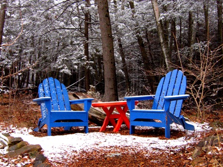
Now I use whatever colors suit my fancy. I’ve taken a lot of inspiration from Mexico, where the free-for-all approach to color seems joyous, unabashed and celebratory. I can’t help but smile when I see these walls from some cabanas near Tulum. I stole the classic complementary color pair blue/orange for my table and chairs, shown at the top of this entry.

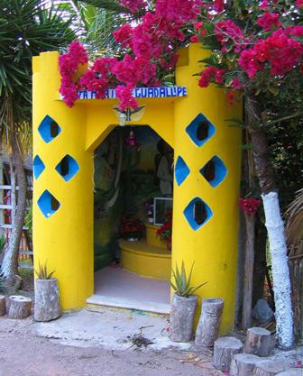
Not far from those bright walls, I found this roadside shrine. It was, for me, a near religious experience colorwise.

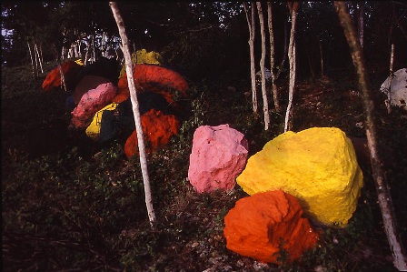
In another part of the Yucatan, I found this scene-which provided an instant lesson in the danger of getting too carried away with paint. Restraint, I realized almost instantly, can be a good thing.

Anyway, back in Tulum, I’m always happy to go in the Que Fresco! cafe anytime, just to sit in these chairs. I thought I’d digest my color lessons there, and see where inspiration led me. I reckoned I might get into trouble slinging paint all over the walls, and painting the rocks was out of the question. I had to start small.

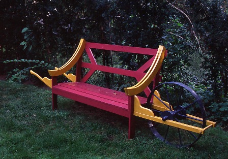
So, I got my color party going by painting the outdoor furniture. It’s not a huge commitment, and if the results are unhappy I can just repaint. If I need to experiment, I can move all my colored furniture around. Although that’s rarely quite as easy as it is at Bob Dash’s garden, Madoo, on Long Island. His wheelbarrow bench is a cinch to relocate. Back in my own garden…

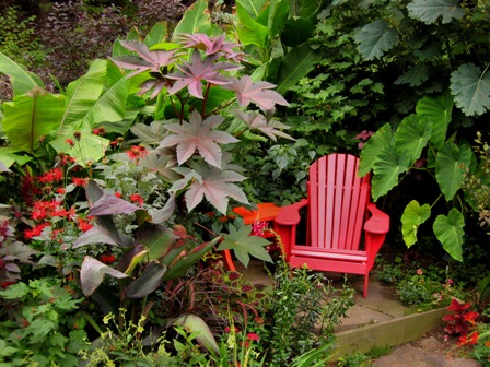
I love buying new bits of furniture for the garden. However I will be honest, I never normally spend much money on it as I love creating my own styles with it after. I will look for furniture from places similar to Afterpay cheap outdoor furniture from Payday Deals to get me started, and then I will go on the hunt for some paint. What I like to do is paint the furniture to match its surrounding foliage. For this, I actually took a piece of a leaf into the paint store and had them mix up a pigment to match.

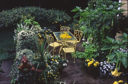
Look what Sydney Eddison did in her Newtown, CT garden for a season-long display. One of the great things about this combo is its appeal even after the sun goes down. Those cheery, bright colors catch the slightest bit of moon or candlelight and the garden lives on into the evening. Sydney paints her outdoor furniture a new color every year. To her, it’s all part of one big color scheme.

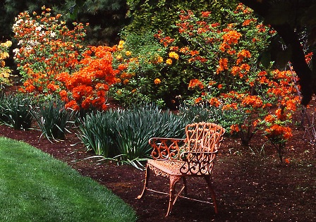
You can also paint to match flowers for a short lived-color kaboom, like this one at a Mike Donnelly designed garden in Westport, CT. It’s a fleeting image, but when those Exbury azaleas go, this part of the garden catches fire.

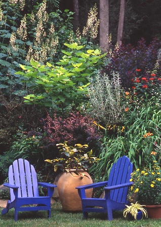
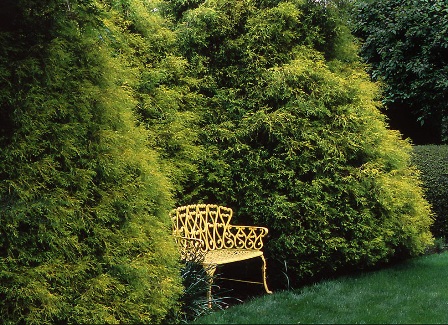
Or go for a more long-lived look – all year round for this one – at the same Westport garden. This evergreen scene never goes out of season. Though I’ve shown lots of plant-and-paint schemes in harmonious, or closely-related color themes, combining colors that are different can add pizzaz to a scene too. I’ve got a useful little mantra for putting paint into the garden. It’s been useful for me, a little anyway. And that is, when in doubt use blue – it goes with every other hue.

Steve Silk

Steve Silk

Steve Silk

Latest posts by Steve Silk (see all)

10 comments… add one

Leave a Comment

wiseacre February 7, 2008, 10:55 am

Great to see these photos. One sometimes never knows what they want until they see it. I want the shrine. Maybe your photos will change my wife’s mind about keeping the garden furniture white.

But people painting rock is going to far!

Wiseacre–Yeah, white is boring! I convinced my wife, who was also reluctant to go out on a color limb, by just painting the stuff (and being fully ready and willing to paint it back if it didn’t pass muster). She couldn’t visualize it, but once she saw it done, she liked it. I think. She said so anyway. Maybe she was just being nice.
I know exactly what you mean about not knowing what you want until you see it. One of the biggest challenges in garden making is seeing what you want, even if its just seeing it inside your head. After all, you can’t make something if you don’t have a clue what it is you’re trying to make.
BTW, If you find a mail order source for those cool shrines, lemme know. Steve

Lisa at Greenbow February 7, 2008, 11:12 am

I love these splashes of color. I really like the way the benches are painted to coordinate with the surrounding flowers.

Thanks Lisa–I’m always a sucker for those harmonious color combos and love to work out elaborate color themse which explore the variations of a single color. Mostly I play with oranges and yellows. Keeps me out of trouble. Steve

jodi February 7, 2008, 11:23 am

I’m with you on using blue, Steve; I use it everywhere possible in our garden; arbour, greenhouse door, fences, MY lawnchair (the others are painted red, green, and yellow) in a nice periwinkle blue that stands out even when we’re in the dreaded ice age like now.
And congratulations to you and the rest of the GGW team; you’ve won an award. See details at Bloomingwriter today.

Jodi–Geez everybody’s a step ahead of me today. I was thinking about doing something more with Blues–here and at home–since there are so many ways to get that great goes-with-everything color into the garden. Steve

Elly Phillips February 7, 2008, 11:36 am

Oh, my! I love your red chair with the castor bean! I’ve been collecting old metal lawn chairs for my own place, Hawk’s Haven, and because I’ve allowed variation in design detail (i.e., few of the chairs match) I’d been painting them all a serene sea green to unify them–a euphemistic way of saying that I wanted visitors to recognize that their presence was intentional rather than unfortunate! However, my longstanding passion for red has been my undoing in this regard–I couldn’t bear to paint the back of one rusty red chair green, so its red posterior faces my deck door and I can enjoy the “rear view” every time I wander into the kitchen or backyard; and then, alas, I found a bright cherry-red chair and couldn’t bear to paint it at all. So much for integration into the landscape! You’re so right about the transformative power of paint in general, though; I’m reminded of my friend Edith Eddleman spray-painting dried grasses in the huge perennial border she designed at the J.C. Raulston Arboretum in North Carolina to add some winter color. Or my friend Candyce Merkle arming herself with an arsenal of spray paints and transforming her dank, dingy cellar stairs into starbursts of gold, blue, red, seagreen, and yellow. (I also cherish Robert Dash’s book, A Painter’s Garden.) As you point out, there’s little to lose, since mistakes can simply be repainted!

Thanks Elly, that castor bean combo is a favorite of mine too. Like your idea of the two-color chair–it’s fun to have your own special view of a color. I too used to be much more rigid in my approach, having anything that was painted be the same color as everything else–but no longer. Now there are chartreuses, oranges, yellows, reds, blues–and I’m having fun now! I have some pictures from Bob Dash’s place for a future post on more paint ideas. He actually paints some of his stuff several times a season, so it matches whatever happens to be in bloom at the time. His place is a color extravaganza. Steve

Pam/Digging February 7, 2008, 12:23 pm

I like your blue and orange furniture combo, and the examples you use from other gardens are right up my alley as well. Except for those cautionary painted rocks—egad!

Last January this topic of colorful, painted garden furniture arose. It must be the time of year when we all want a little color, and if flowers aren’t there, we turn to the paint can.

Pam–Yep, you have to watch out for those rocks. And Elly’s comment mentions the spray painted grasses; sorry that’s a bridge too far for me as well, at least for now. I love using paint, and now’s the time I think about it, since painting furniture is an indoor activity and up here in Connecticut, my gardening efforts are rather limited in February. Liked the pix at your link, they reminded me of some of my own pictures of sheds and parts of houses painted in daring schemes. Thought I might post them. After all, why not push other folks envelopes on what is tasteful, colorwise? Steve

Curtis February 7, 2008, 9:33 pm

I like the idea of painting the furniture to tie in or contrast the surroundings.

Thanks Curtis-It’s an effect I never tire of, especially since, if one color gets old, I can easily do another color. A new paint job seems to refresh that whole area of the garden. Steve

Chookie February 7, 2008, 9:54 pm

I love your blue chairs! (And goodness me, who has a burgundy plant fetish then, hmm?) Red would a bit hard to live with in my climate, but of course we don’t suffer from winter colour-starvation here. The rocks have given me an idea, though. In your climate, it might be fun to have something that is completely hidden in summer by foliage but that pops out in midwinter for you to feast your eyes on. A row of vermilion bollards against a shadowy evergreen hedge, for example. Or is that a common trick?

Oh yeah Chookie–I’ve got the burgundy plant fetish alright, got it bad, even worse than my chartruese plant fetish. The reason is that burgundy seems to enrich and deepen almost any part of the garden it’s placed in. I sort of figure some of my painted furniture, treillage and such is largely hidden by foliage (at least when viewed from the house) and then when the leaves fall in autumn I have all those pockets of color. The shadowy evergreen hedge as a backdrop for painted stuff–there’s something I have to work on. Nice idea! Steve

Ken from Sweden February 8, 2008, 1:27 am

Hi Steve!
I cant agree more, it is nice whith white piece of furniture in the garden but here in Sweden we get the furnitures damiage every year whith green mould, and thats not fine and it takes a lot of time to remove.
Derfor is color on the furniture good, darker color is best like green, grey and red.
Green is nice but a agree it is allready all around you.
It shall be fun to show what I mean in the spring and summer on my blog thise year. Regards Ken

Hi Ken–I’m looking forward to seeing some of your painted furniture. Sometimes you can buy mold and mildew resistant additives for paint, that may help keep your paint jobs looking fresh longer. And yes I agree that, in general, darker colors are better. It helps them sink into their surroundings more, makes them look more like they belong in their place. Steve

Mr. McGregor's Daughter February 8, 2008, 3:27 pm

Love your painted furniture! My problem is that I love to paint, so I get a bit carried away. I’m still working on kid-sized Adirondack chairs. Can I paint them just 1 color? Noooo – I have to use 3 or 4 colors. Forget trying to match that up with anything.

Thanks MMD. I know what you mean about those multi-color projects, I have a bench painted 3 colors and not only is it hard to match with its surroundings, it took forever to do the paint job. But it looks fun and its chartreusey hues just seem to glow in the shade. Steve

Maria February 8, 2008, 8:24 pm

I love the use of color in Mexico–particularly the hardscape. I just put up pictures from San Miguel de Allende on my blog, http://www.citydirt.net.

Maria-It’s a fearless palette one sees in Mexico. Always invigorating! Steve

[shareaholic app=”recommendations” id=”13070491″]

33 Shares
Share
Tweet
Pin33
Share