

I’d like to add a coda to Nan’s most excellent post on using black and white photography to evaluate the role of tone, or value, as an element in creating pleasing combinations. I’ve got a whole other diagnostic use for black and white, but more about that in a moment.
First I’d like to try to shed some light on the whole tone notion by referring to my color mentor, Sydney Eddison. She and I spent a couple years working on a book about color, ”the Gardener’s Palette: Creating Color in the Garden,” (look for it in the GGW bookshop) and I can tell you it was a treat to work with someone who’s been studying color formally and informally for nigh on 50 years, and who shares her knowledge so readily. While Sydney would agree with Andrew Lawson that tone is a color dulled by the addition of gray, she puts a finer point on the topic. In addition to tone, she recognizes a shade, a color darkened by the addition of black (think ‘Queen of the Night’ tulips, Canna ‘Australia’, or even a purple smokebush (Cotinus coggygria ’Purple Robe’) and a tint, a color brightened by the addition of white (think pink, Creamsicle orange, or pale blue forget-me-nots). So we have shades at the dark end of the black-to-white spectrum, tints at the light end, and tones covering the vast swath that lies between.
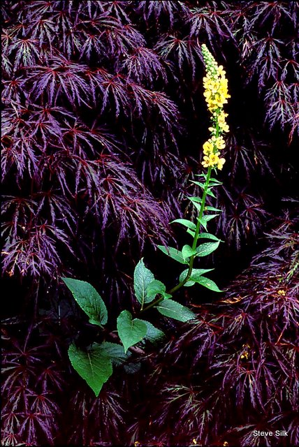
To get maximal tonal contrast, you can pit shades against tints. Or anchor a planting with shades, and accent it with tones. I think that helps explain why dark, “black” leafed plants make superlative backdrops for almost any companion, like the Japanese maple does for the verbascum in the scene above from Sydney’s garden. And all those stunning gold foliage-based combos Nan shows, well, those golds are really tints—there’s no gray or black in those chartreusey or lemony colors—and tints jump out against tones (or shades). So when considering tonal contrasts, or harmonies, it may help to keep in mind these three separate provinces of any individual color. Now, on to my coda.
Black and white photography is great for assessing the tonal range of a planting. And it is even better at offering what I think of as an X-ray view of the garden. No other technique or trick I’ve ever seen or heard about is as effective at revealing the “bones”, or structural elements of a garden. And all gardens need bones. They are the essential component for providing year-round interest. I’ve seen lots of gardens, and heard lots of gardeners complain that they know something is wrong with their garden, but they don’t know what. I’ve found, 99 times out of 100, that structure is the missing piece. Either there’s none at all or, perhaps, not enough, or maybe what’s there is assembled weakly, or is not prominent enough.
A black and white photo reveals any lack in an instant. Black and white photography, as opposed to color, is much more about shape. B&W photos live or die by the expert juxtaposition of shape and texture, heightened by light. Color photos are all about…color! Which tends to be very distracting if you’re looking for something besides color. If you look at a colorless image, the shape and texture become the dominant elements. So does the idea of line-you can judge for yourself if the edge of bed or border creates a pleasingly sinuous shape, or is as rigorously, crisply formal as you’d like.
When you look at a color photo of your garden you see…all those colors! And don’t they look neat! But when you remove the color, you see shape and texture and line. Structure. Here are two obvious examples, the first from Sydney’s garden. Yes, those big, billowy plants create a lovely color scene, one that seems just about overripe with potential.

But when that view is simplified to black and white, the beauty of the structural composition emerges. See how all those shapes and textures combine in pleasing proportions? See how the ornamental grass plays a crucial role in this combination? To me this is an effective garden vignette, even in B&W.

Now let’s take a view from a garden near Sydney’s house. Lots of color, looks pretty good with all those black eyed-Susans.

But now the black and white version. As it makes clear, there is virtually no structure here at all. As soon as those black-eyed Susans go by, that garden is over. Mush. No bones about it, so to speak. Which is fine–if you’re designing a peak bloom garden that shines brightly for a few weeks and is then over and done. But most of us want more lasting effects. So we build in bones.

So if you feel the urge to get out and X-ray parts of your own garden, here a few simple tips to make the process easier. First, to get B&W images, follow the simple steps Nan included in her post. That’s the easy part. Now, when you’re actually out in the garden taking pictures, shoot wider views that allow you to analyze big bites of the landscape. Of course you can micro-manage too, and examine aspects of varied combinations as Nan did, but with an eye toward structure this time around. Most importantly take you pictures on an overcast or rainy day, or toward dawn or dusk. You won’t want lots of harsh shadows mucking up the picture. That can make it hard to see the bones. I need to shout out to my Nashville buddy, gardener and plantsman extraordinaire J. Paul Moore, who first showed me just how useful black and white photography can be for assessing garden designs. Thanks, Paul!
Steve Silk
Latest posts by Steve Silk (see all)
- Why I Love Using Plume Poppy In My Garden - October 16, 2015
- The Background On Backgrounds - November 21, 2009
- GGW Design Lines: Big And Bold - October 23, 2009